Practical Color Theory for Pixel Artists
Colors are an important topic in any form of visual art. In this article, I will give some practical guidance on how to approach colors specifically for making pixel art.
Properties of Colors
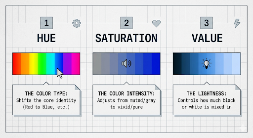
For pixel art, I recommend focusing on HSB (Hue, Saturation and Brightness) which we will break down below.
Why I Recommend HSB
Having your color picker allow you to manually adjust saturation and brightness allows for methodical color picking.
For example, if you want to paint a highlight, move the brightness slider up. For shadows, move it down. If the color is too flashy, reduce the saturation.
"This allows you to pick as you think when drawing, letting you focus on the art rather than trying to guess using your eyes: Does this shirt look brighter or darker than the hand?"
The HSB Breakdown
- Hue: The color spectrum. Reds/Oranges are "hot," Blues/Purples are "cold." This is an emotional association.
- Saturation: How colorful or far from gray it is. (Like emerald green and apple green).
- Brightness: How bright or dark the color is.
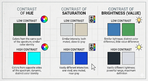
The Importance of Contrast
High contrast defines form; low contrast conveys softness and rest. Contrast can happen in Hue, Saturation, Brightness, or a combination.